


[RU] Фирменный стиль для бренда газированных напитков «Qitbee»
Бренд является молодежным, прогрессивным, а что самое главное-полезным. В составе напитка вместо сахара добавлен натуральный мёд,
что выделяет бренд на полке среди конкурентов. Именно на этом и делается акцент в названии бренда: “quite” и “bee”- “совсем пчелиный”.
Бренд является молодежным, прогрессивным, а что самое главное-полезным. В составе напитка вместо сахара добавлен натуральный мёд,
что выделяет бренд на полке среди конкурентов. Именно на этом и делается акцент в названии бренда: “quite” и “bee”- “совсем пчелиный”.
[EN] Corporate identity for the brand of carbonated drinks "Qitbee"
The brand is youth-oriented, progressive, and most importantly, useful. Natural honey is added to the drink instead of sugar,
which distinguishes the brand on the shelf among competitors. This is exactly what the emphasis is on in the brand name: “quite” and “bee" - “quite bee-like".
The brand is youth-oriented, progressive, and most importantly, useful. Natural honey is added to the drink instead of sugar,
which distinguishes the brand on the shelf among competitors. This is exactly what the emphasis is on in the brand name: “quite” and “bee" - “quite bee-like".

[RU] Во время разработки напитка были проведены научные исследования, которые подтверждают отсутствие негативного влияния продукта
на организм даже при ежедневном употреблении. И не только по количеству калорий, но и по общему составу.
на организм даже при ежедневном употреблении. И не только по количеству калорий, но и по общему составу.
[EN] During the development of the drink, scientific studies were conducted that confirm the absence of a negative effect of the product
on the body, even with daily use. And not only in terms of calories, but also in terms of the overall composition.
on the body, even with daily use. And not only in terms of calories, but also in terms of the overall composition.


[RU] Фирменный знак основан на соединении двух букв «Q» и «B» - это первые буквы слов, на основе которых строится название бренда.
Монограмма позволяет придать Вашему бренду индивидуальность и узнаваемость, поскольку ее проще запомнить, чем целое название.
Монограмма позволяет придать Вашему бренду индивидуальность и узнаваемость, поскольку ее проще запомнить, чем целое название.
[EN] The brand name is based on the combination of two letters "Q" and "B" - these are the first letters of the words on the basis of which the brand
name is based. A monogram allows you to give your brand personality and recognition, because it is easier to remember than the whole name.
name is based. A monogram allows you to give your brand personality and recognition, because it is easier to remember than the whole name.


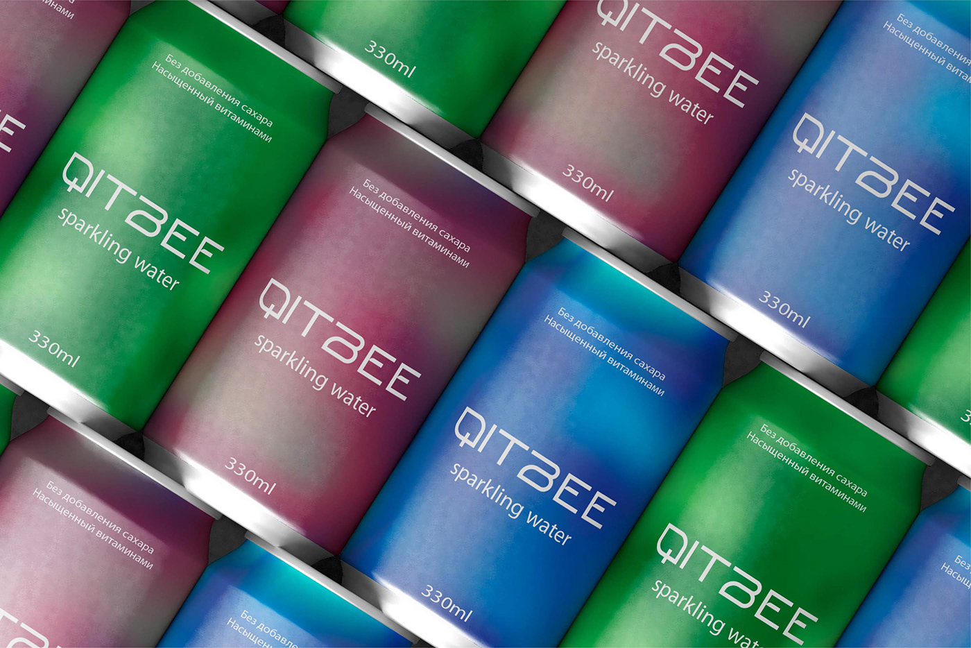
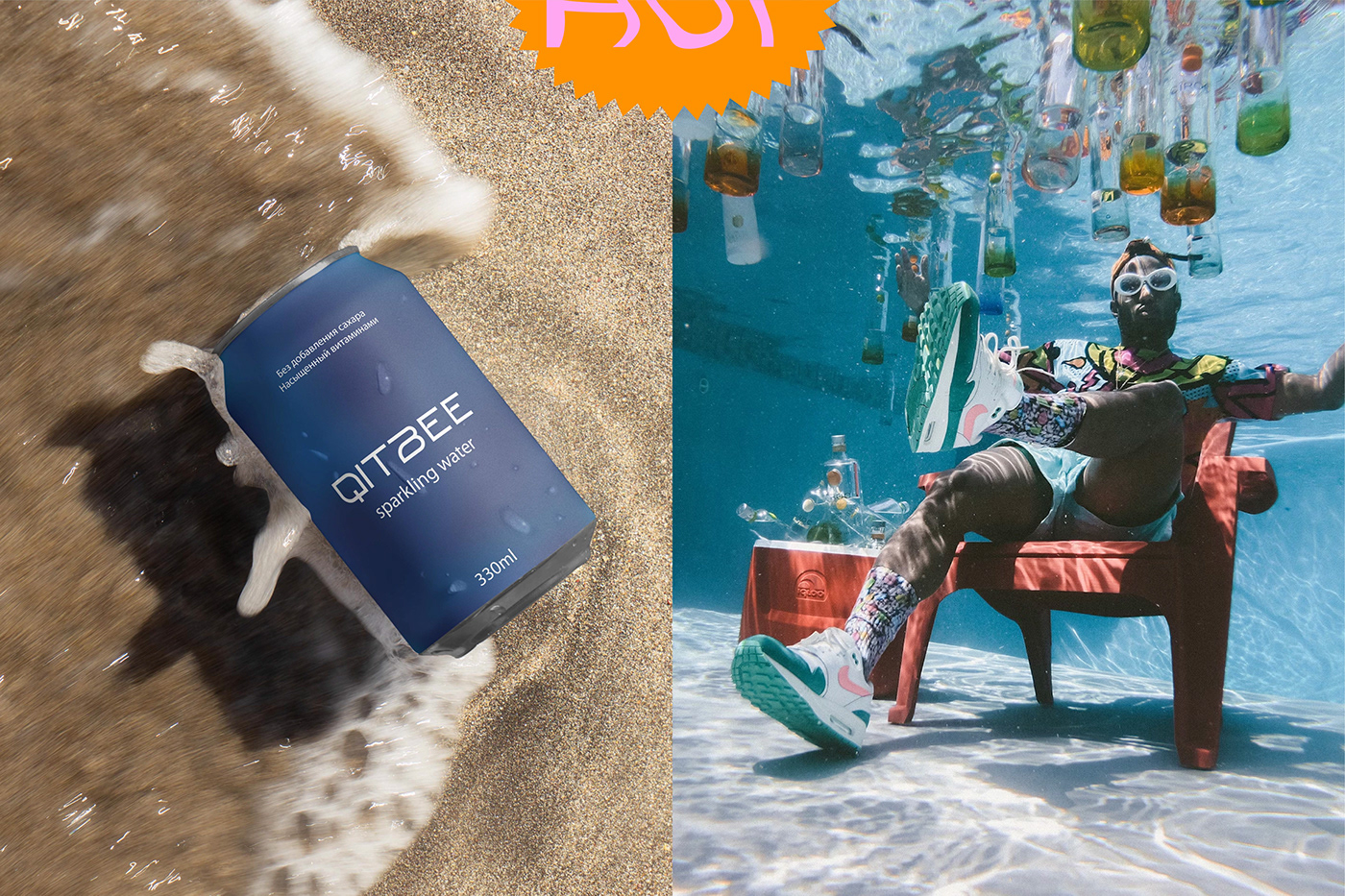
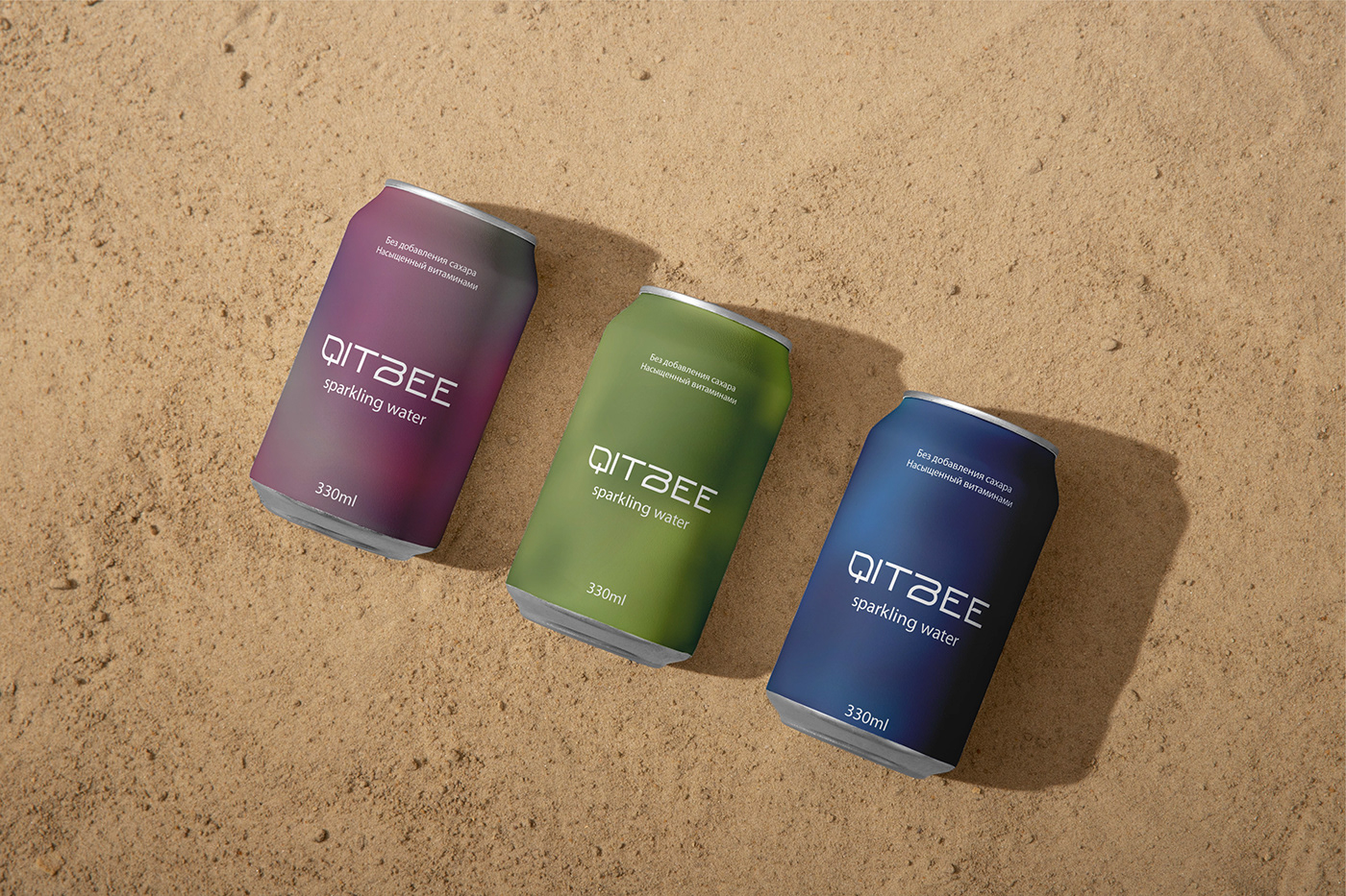
[RU] Слоган Бренда Qitbee — «Вкус к жизни». Поэтому основными цветами являются яркие, привлекающие внимание, но не ядовитые, что
опять же указывает на натуральность и отсутствие химикатов в составе. Данные цвета поднимают настроение, ассоциируются с хорошим
времяпрепровождением. Такую баночку хочется взять с собой как на тренировку в зал, так и на пляжную вечеринку.
опять же указывает на натуральность и отсутствие химикатов в составе. Данные цвета поднимают настроение, ассоциируются с хорошим
времяпрепровождением. Такую баночку хочется взять с собой как на тренировку в зал, так и на пляжную вечеринку.
[EN] The slogan of the Qitbee Brand is "A taste for life". Therefore, the main colors are bright, eye-catching, but not poisonous, which
again indicates the naturalness and absence of chemicals in the composition. These colors are uplifting, associated with a good
time. I would like to take such a jar with me both to a gym workout and to a beach party.
again indicates the naturalness and absence of chemicals in the composition. These colors are uplifting, associated with a good
time. I would like to take such a jar with me both to a gym workout and to a beach party.


СПАСИБО ЗА ИНТЕРЕС К МОЕЙ РАБОТЕ!
Меня зовут Маргарита. Я графический дизайнер.
Вы можете связаться со мной и мы обсудим все детали работы.
THANK YOU FOR YOUR INTEREST IN MY WORK!
My name is Margarita. I am a graphic designer.
You can contact me and we will discuss all the details.
КОНТАКТЫ | CONTACTS


